Not all sloths are slow
For ten years, I attempted to write and illustrate a children's book. And for ten years, I had nothing to show for it. It was the same process over and over: an idea would come to me, and I couldn't wait to turn it into a book. It had to be BIG, bold, and riveting. Again and again, I would find myself repeating the exact same scenario: inspiration, pursuit, frustration... and defeat.
After a decade of this relentless loop of discouragement, I woke up early one Saturday morning with the sudden realization... it was just too much.
I was trying to run before I could crawl. How could I write a captivating story—with shocking twists and obstacles to overcome—when I had never even finished a single short story? How could I illustrate a book with a plethora of fascinating characters when I hadn't learned basic character design? How could I paint numerous complex backgrounds when I hadn't mastered the foundations of layout and composition?
Going Simple
At last, that fateful Saturday morning, I sat down at my desk with a simple cup of coffee and came up with a simple plan:
Step 1: Choose an animal. A simple animal.
Step 2: Create a character. A simple character (ok... two tops.)
Step 3: Design an environment. A simple environment.
Step 4. Make a connection. A simple connection.
Step 2: Create a character. A simple character (ok... two tops.)
Step 3: Design an environment. A simple environment.
Step 4. Make a connection. A simple connection.
It was all so simple... it just might work! *sips coffee*
CHOOSING AN ANIMAL
Let's face it, this story was not going to be some groundbreaking piece of work, so picking the right animal was critical. It had to be unique. It had to be goofy. It had to be so incredibly fascinating and odd that no one knows why it even exists in the first place.
It clearly had to be sloth. Ok, so a panda would have worked too. But a sloth just felt right to me, and those faces are begging to be drawn.
Creating a Character
Character design was hands down my biggest learning while working on this book. To be honest, it was downright overwhelming in the beginning. You have to invent a character from scratch—with a unique look, unique expressions, and unique poses—all of which have to be wrapped up into one cohesive package with perfect execution.
I went about this all wrong in the beginning. I looked at hundreds of reference photos, and began to sketch the same sloth over and over again. After drawing the same dull face again and again, I finally asked myself: what makes my sloth different? And it hit me: a fast sloth! Do they exist? Of course not. But this is my book, and my sloth is going to be the fastest, silliest sloth there ever was!
It was around this time that I realized the story needed two characters. Many children may not even know what a sloth is, so the norm needed to be established. What do sloths look like? Where do they live? How do they move? What do they eat? Then, I can show my audience how awesome my speedy sloth is. So different in almost every way. Let the character design begin!
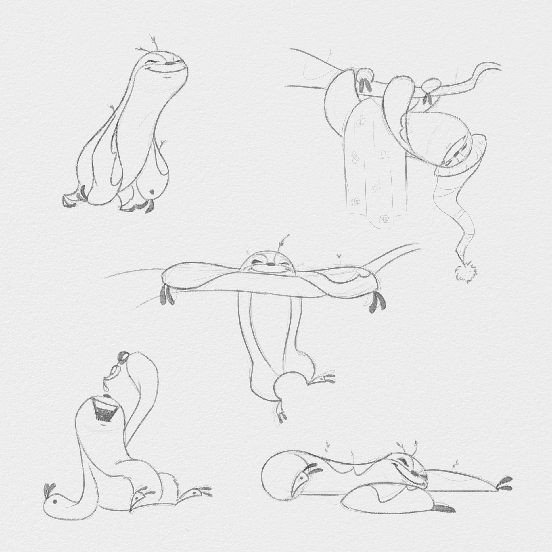
Slow Sloth Character Sketches
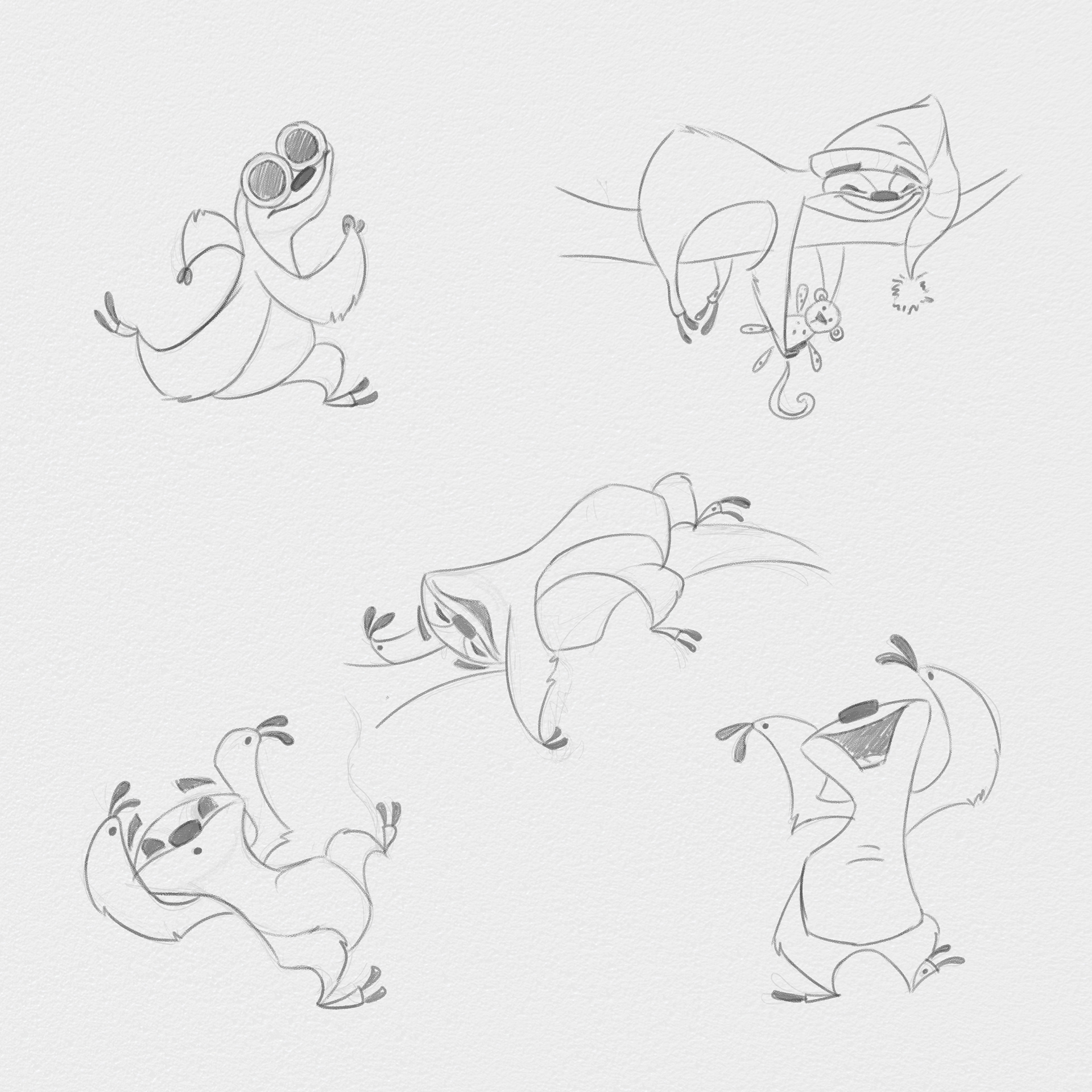
Speedy Sloth Character Sketches
Slow Sloth should exude calmness. His eyes are almost always closed, and his movements appear lazy and exhausting. Fun fact of the day: sloths move so incredibly slow that moss grows on their hair. Slow Sloth clearly needs to be covered in bright green moss all over.
Speedy Sloth should exude energy. He's always in motion, whether it's jumping, dancing, or swinging. His movements appear effortless and sporadic. And even if he's not on the move, his body language should still look goofy and carefree.
I played with shapes and angles to further differentiate them. Slow Sloth is rounder and softer, while Speedy Sloth has sharper and more defined features (i.e. his nose, eyebrows, and elbows.) Color also plays a key role in differentiation: Speedy Sloth has a much warmer color tone. After all, he doesn't care about blending in with his environment.
I felt proud of my character design up to this point, but it still felt like something was missing... there needed to be some visual tip-off as to just how slow our Slow Sloth really is. That's when I realized he needed a buddy: his snail. And what if this snail was always one step ahead of him? Now that's a slow sloth.
Designing an Environment
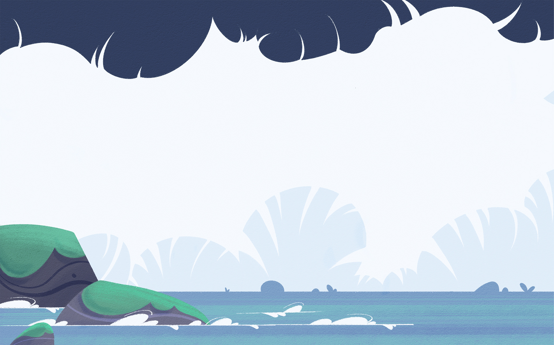
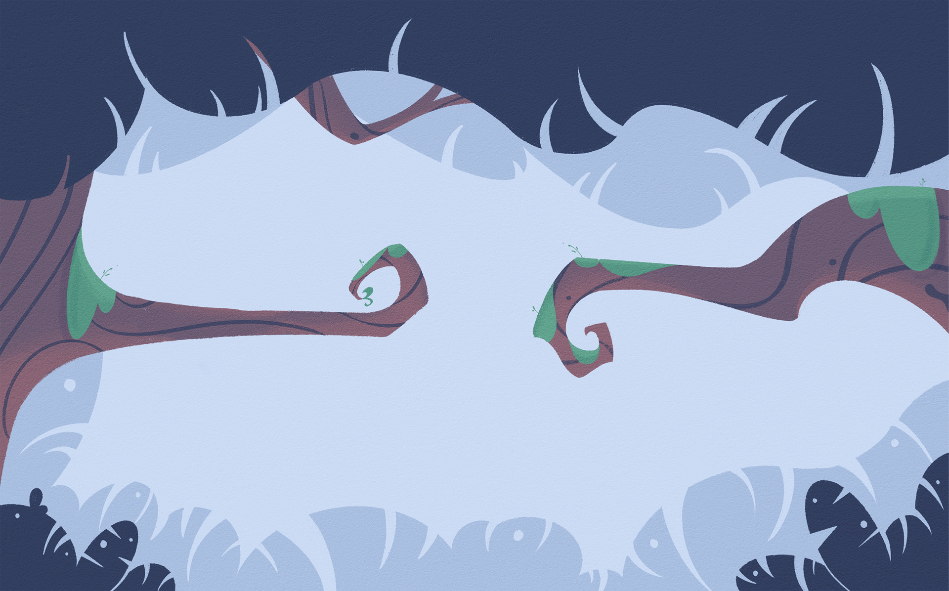
This choice was decided for me before I even got to it. Where do sloths live? The jungle! The design challenge I posed to myself is this: keep it simple, but not boring. The environment needed to feel detailed enough to draw you in, but simple enough to not bog down the creative process.
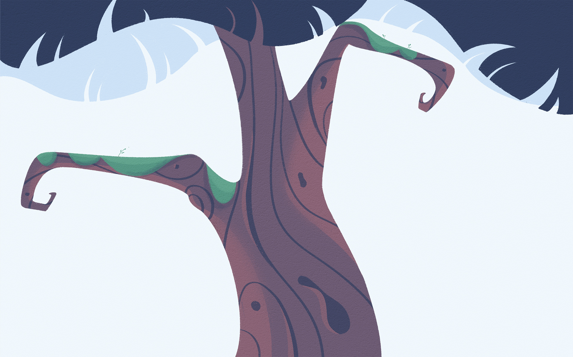
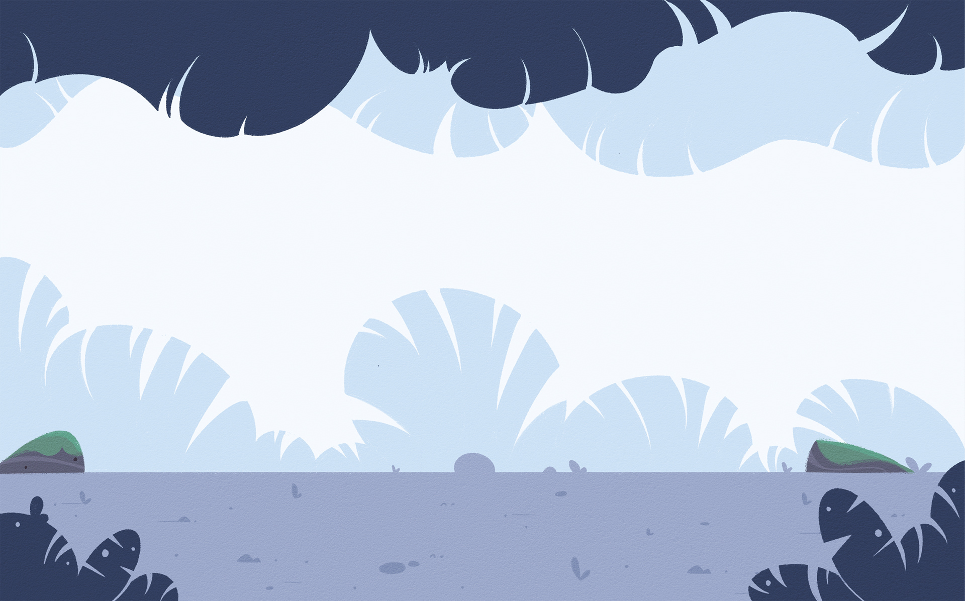
I started by sketching only the basics. Tree trunks, rocks, foliage.. that's really all you need to establish where our sloths are. To tie the environment to the characters, I chose to use similar angles. For instance, the tree trunk bulges loosely resemble the sloths' bellies, and the foliage silhouettes resemble the sloths' fur texture.
Once these elements started to feel like a cohesive concept, I put together 4 variants of the same environment that could be reused throughout the book in creative ways.
Making a Connection
By now, the connection between everything felt perfectly laid out for me: highlight the differences between a slow sloth and speedy sloth. The story is a simple "day in the life" narration as we watch how these two friends go about their routines in their own individual ways. Sprinkle in some "oops" moments where Speedy Sloth goes a little too fast, and add a dollop of wholesomeness to highlight their similarities in the end. After ten years of attempting to write a single story, I wrote the first draft of "Not All Sloths Are Slow" in less than an hour.
In the end...
Is it a deep and complex story? No. Is it a finished story? Yes. And I couldn't be more proud of that fact. Please enjoy a sneak peek at "Not All Sloths Are Slow."